
The Architecture of a Perfect Travel Spreadsheet: Logic Before Logistics
 VR Team
- December 31, 2025
Travel is one of the few human experiences that is simultaneously exhilarating and exhausting. We dream about the destination—the street food in Seoul, the art in Florence, the lights of Tokyo—but we dread the execution. The gap between “booking the flight” and “boarding the plane” is filled with a thousand small details, financial calculations, and logistical hurdles.
Most travelers fall into two camps when trying to bridge this gap. First, there are the Improvisers, who keep details in their heads or scattered across email threads, inevitably leading to that sinking feeling at airport security that something has been forgotten. Second, there are the App-Dependent, those who download rigid travel apps that force them into a specific workflow, locking features behind paywalls and refusing to adapt to the nuance of a complex, multi-city trip.
But there is a third path, favored by those who understand data and crave control: The Custom Travel Spreadsheet.
If you are reading this, you likely understand that a travel spreadsheet is more than just a grid of cells. When properly engineered, it functions as a bespoke piece of software. It becomes a Command Center that adapts to your specific needs, handling the math so you can handle the adventure.
However, a truly effective “travel spreadsheet” isn’t just a digital notebook. It requires a specific architectural logic. It requires distinguishing between Inputs (what you control) and Insights (what the system tells you).
If you were to design the ultimate travel spreadsheet, stripped of all the noise, here is the exact philosophy, backend structure, and psychological design you would need to engineer into it.
Part 1: The Travel Spreadsheet Dashboard (The Brain)
The first mistake most people make when attempting to organize a trip is mixing their data entry with their visualization. They put a flight cost next to a packing list item next to a hotel address. This creates visual clutter and high cognitive load.
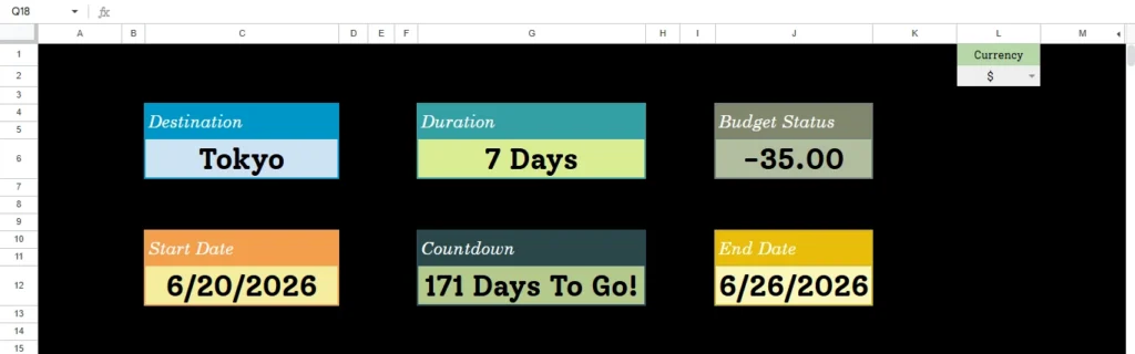
A professional-grade travel spreadsheet begins with an Overview Tab. Think of this not as a page in a notebook, but as the dashboard of a car or the cockpit of a plane. Its job is not to hold every detail, but to display the “Vital Signs” of your trip at a glance.
To create this, your travel spreadsheet must rely on a strict logical separation between Manual Inputs and Automated Logic.
The Temporal Logic: Mastering Time
Time is the most rigid constraint of any trip. Yet, most people visualize their trip simply as “Dates.” A smart system understands that dates are just data points; what matters to the human brain is duration and anticipation.
- The Input Restriction To minimize human error, a robust system must restrict interaction. The user should only ever have to define the boundaries of the trip: the Start Date and the End Date.
- The Automated Output Once those boundaries are defined, the travel spreadsheet’s internal logic must take over. It shouldn’t just record the dates; it should interpret them.
- Duration Logic: The system must automatically calculate the total span of the trip. This seems simple, but it is the foundational number that drives every downstream calculation, from hotel nights to daily spending limits.
- The Psychological Countdown: This is the most critical feature for “Trip Readiness.” A static date like “October 14th” is abstract. It doesn’t trigger a response. A dashboard that dynamically updates to say “14 Days Until Departure” creates immediate, actionable urgency. It shifts the user from “planning mode” to “execution mode” automatically.
The Financial Engine: The Decoupled Logic
Financial anxiety is the number one stressor in travel. “Am I spending too much?” “Will I run out of money before the end?” A standard list of expenses offers no comfort because it lacks context. An engineered travel spreadsheet analyzes liquidity.
- The Budget Hierarchy The logic here requires a flow of data from general to specific. You define a single “Anchor Number”—the Total Budget. From there, the system must immediately derive your Daily Allowance based on the duration calculated earlier. This is a critical metric. Knowing you have $5,000 is vague; knowing you can spend $350 a day gives you a concrete operational limit.
- The “Decoupled” Visualization Here is the piece of logic that separates a novice attempt from a master tool: The Budget Progress Bar.
Most systems fail here because they link spending to time. They assume that if you are halfway through your trip dates, you should be halfway through your budget. This is logically false. You might prepay for flights and hotels months before you leave. You might be at 0% of your trip duration (you haven’t left yet), but have already consumed 40% of your budget.
Therefore, the visual indicator must be mathematically decoupled from the calendar. It must strictly represent the consumption of funds against the total limit.
The Result: A visual bar that fills up based purely on consumption. If that bar turns red while your “Countdown” shows you haven’t left yet, the dashboard is screaming a warning that you are over-leveraged before you even pack a bag. This is the kind of insight only a custom logic system can provide.
Destination Management
Finally, the system needs to handle the destination identity. Modern travel is rarely point-to-point. A user might go to Japan, then Korea, then France. The Dashboard needs to accommodate free-text input to anchor the identity of the trip, acting as the header for the entire project.
Part 2: The logistics (The Body)
If the Overview Tab is the brain, handling the abstract concepts of time and money, the Packing Tab is the body, handling the physical reality of inventory.
Packing is often viewed as a chore, a “dumb” list of things to throw in a bag. But logically, it is a complex inventory management challenge. You are trying to move a subset of your possessions from a static location (home) to a mobile container (suitcase), anticipating needs for weather, culture, and activities.
To solve this in a travel spreadsheet, you cannot use a single long column. You must use Categorized Boolean Logic.
The Architecture of Categories
Cognitive Load Theory suggests that the human brain struggles to process lists with more than 7 items unless they are chunked. A list of 50 mixed items (socks, passport, toothbrush, charger) is overwhelming. It leads to decision fatigue.
The solution is to architect the database into four distinct logic blocks:
- Clothing: (Variable based on weather/duration).
- Toiletries: (Consumables, liquids, hygiene).
- Documents: (The “Critical Failure” items—passports, visas, insurance).
- Tech: (The connectivity layer—cables, batteries, adapters).
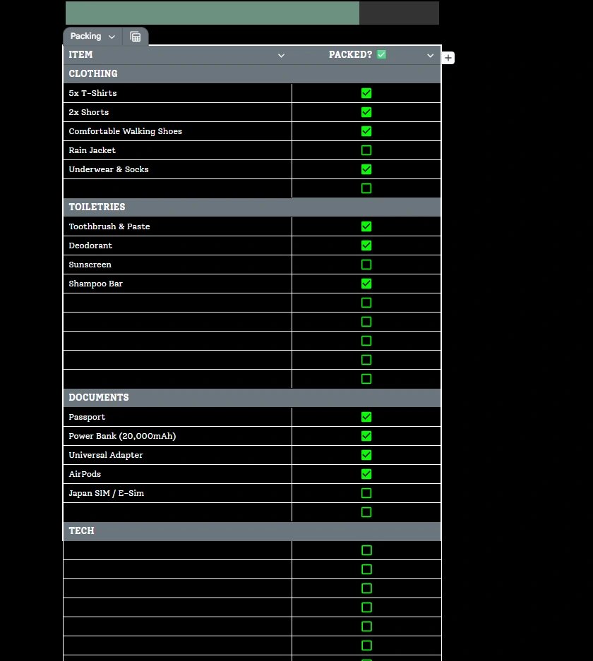
By segmenting the data, the system allows the user to focus on one “mode” at a time. When checking the “Tech” block, you are thinking about power; you aren’t distracted by wondering if you packed your swimsuit.
The Boolean Feedback Loop
The interaction mechanism here is vital. A bullet point is passive; it’s just text. A Checkbox is active; it’s a data point.
By utilizing Boolean data (True/False logic), your travel spreadsheet can engineer a Packing Progress Bar. Just like the financial bar in the dashboard, this visualization scans the specific ranges of your packing lists.
The Gamification of Chores This is where logic meets psychology. As you physically pack items and engage with the system, the progress bar moves from 0% to 100%.
It turns a tedious chore into a “completionist” game. The visual feedback provides a dopamine hit, reducing the stress of the activity. Furthermore, it creates a binary state of readiness. If the bar is at 98%, you know you are missing something. You don’t have to guess; the data tells you the job is incomplete. This ensures you never arrive at the airport with that nagging feeling that you’ve forgotten something essential.
We have now deconstructed the architecture of a high-performance travel planner. You understand the theory. You see why the separation of inputs and automated outputs creates clarity. You understand why decoupling the budget bar from the calendar saves you from overspending. You see how Boolean packing lists reduce cognitive load.
Now, you face a choice.
You can try to engineer this travel spreadsheet yourself. If you have a background in data architecture, you know that setting up these dependencies is not a five-minute task. You have to ensure the countdowns trigger correctly based on today’s date. You have to ensure the budget bars don’t break when you add a new currency. You have to build the conditional formatting rules that turn the bars from green to red. You have to rigorous test the system to ensure that a typo doesn’t ruin your itinerary.
It is a complex puzzle of dependencies, formatting, and logic gates.
Or, you can simply start planning.
We have already done the engineering. We have spent the hours refining the layout, testing the logic, and polishing the interface.
The Ultimate Travel Planner is built on the exact principles outlined above.
- The Overview Dashboard is pre-configured and ready for your inputs.
- The Budget Logic is already decoupled, offering you instant financial clarity.
- The Packing Lists are categorized, with the progress bars fully calibrated.
You don’t need to be a systems architect to travel like a pro. You just need a tool that thinks like one. The logic is complex, but the experience shouldn’t be.